
AI Cost & Usage
Overview
The AI Cost & Usage Explorer gives you a single query surface for all AI providers & Cloud Provider AI spend & usage - replacing the manual work of reconciling costs across multiple provider consoles. Filter, group, and drill into cost and token consumption across any combination of dimensions, then export the results for chargeback or budget review.
AI spend fragments across provider consoles - Anthropic, OpenAI, Bedrock, Vertex, and others each report costs differently.
Finance teams typically spend hours each week manually pulling and reconciling these numbers by team, model, and environment. The Explorer collapses that into one view with consistent dimensions and cost definitions across every provider.
Data granularity and latency
How fresh and how granular the data is depends on the provider.
| Provider | Cost granularity | Usage granularity | Data Freshness |
|---|---|---|---|
| Anthropic | Daily | Hourly | Usage: 3-24 hours Cost: ~1 day |
| AWS Bedrock | Hourly | Hourly | ~1 day |
| GCP Vertex AI | Hourly | Hourly | ~1 day |
| Azure OpenAI/Foundry | Daily | Daily | ~1 day |
How the Explorer works
Grouping and time controls
The toolbar at the top of the page controls how data is organized:
| Control | What it does |
|---|---|
| Primary Group by | The primary dimension for the chart and table. Options include Model, Workspace, User, Provider, and others. |
| Secondary Group by | The axis for the chart - typically Date. |
| Hourly/ Daily / Weekly / Monthly | Time granularity for the chart bars. |
| Date range | Custom start and end dates, or a preset window (e.g. 30D). |
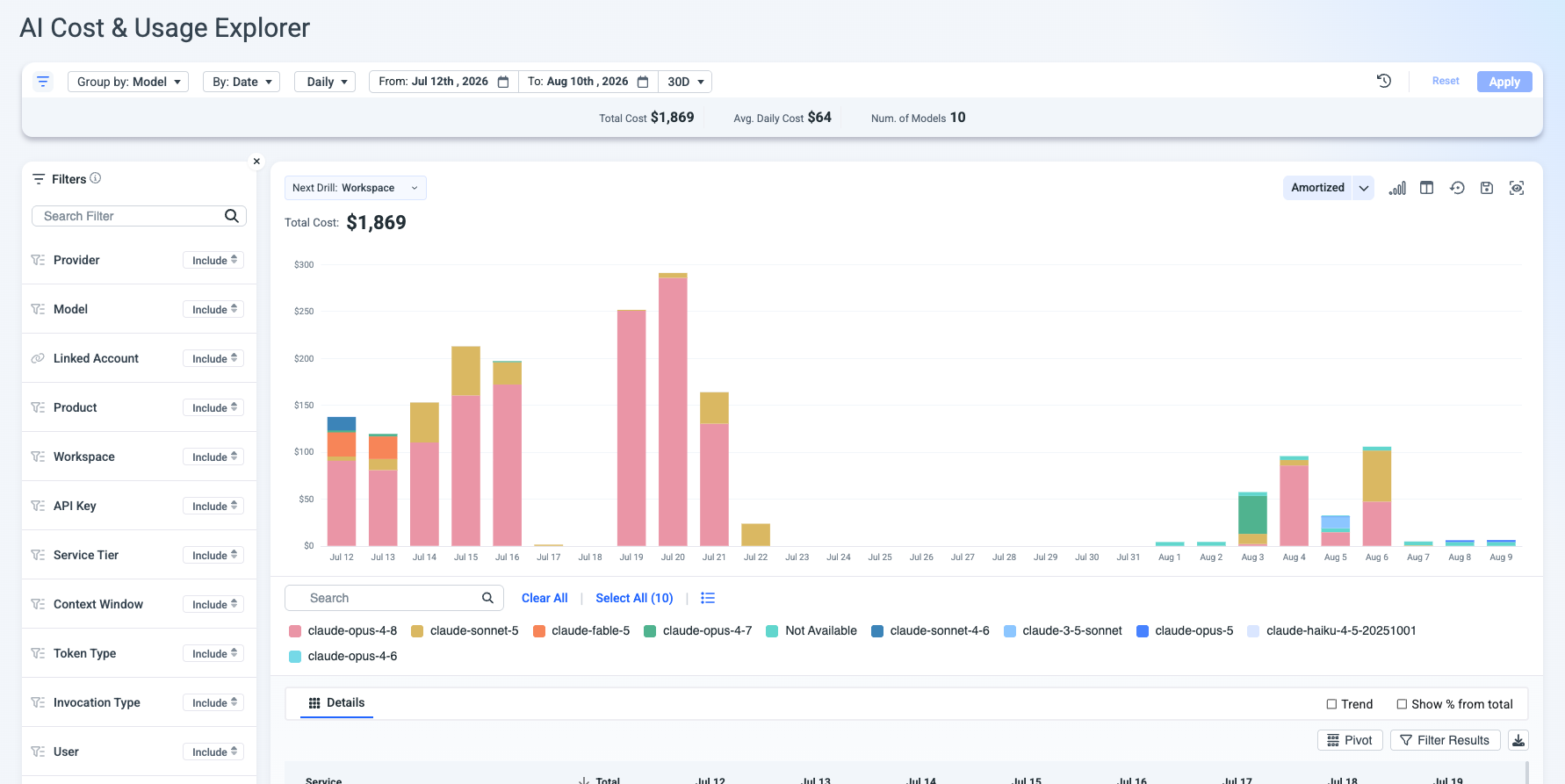
A summary bar below the toolbar shows aggregate metrics for the current view - Total Cost, Avg. Daily Cost, and a count tied to the Group By dimension (e.g. "Num. of Models" when grouped by Model).
Filters
The left panel provides multi-dimensional filtering. Each filter supports Include or Exclude mode:
| Filter | Use it to… |
|---|---|
| Provider | Isolate a single AI provider (e.g. Anthropic, OpenAI, AWS Bedrock). |
| Model | Drill into specific models (e.g. claude-opus-4-8, claude-sonnet-5). |
| Linked Account | Scope to a billing account. |
| Product | Filter by product line. |
| Workspace | Isolate a team or business unit for chargeback. |
| API Key | Attribute cost to a specific integration or service. |
| Service Tier | Compare cost across service tiers. |
| Context Window | See how context window size correlates with cost. |
| Token Type | Break out cache reads, uncached input, output, and cache creation tokens. |
| Invocation Type | Filter by how the model was called. |
| User | Attribute cost to individual users. |
Measures
The measure selector (top-right of the chart area) controls what the chart and table display. It contains three categories, each with its own set of metrics.
Cost
Financial cost metrics. Use these for chargeback, budget tracking, and spend analysis.
| Measure | What it shows |
|---|---|
| Unblended | The raw pay-as-you-go cost before any discount or commitment adjustments. |
| Amortized | Cost with commitment-based discounts (e.g. reserved capacity, enterprise agreements) spread evenly across the covered period. Use this for steady-state budget views. |
| Public Cost | The provider's published list price, before any negotiated discounts. Useful for calculating effective discount rates. |
Usage
Consumption metrics that show volume independent of cost. Use alongside Cost measures to spot inefficiencies - high usage at low cost means your model mix is optimized; rising cost with flat usage means pricing or tier changes.
| Measure | What it shows |
|---|---|
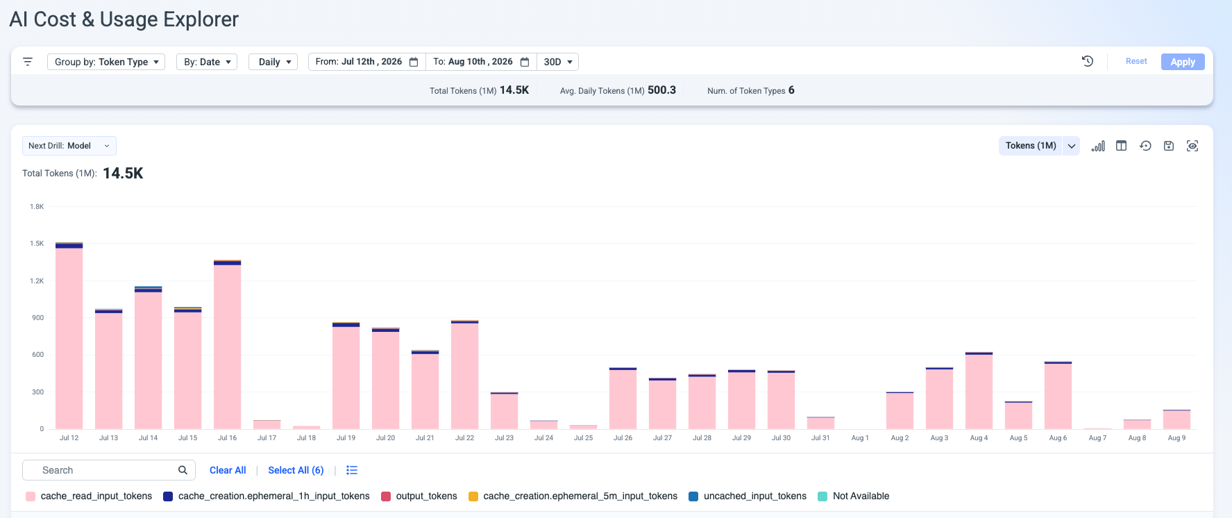
| Tokens (1M) | Total token consumption in millions. Summary bar shows Total Tokens (1M), Avg. Daily Tokens (1M), and Num. of Token Types. |
Tokenomics
Derived efficiency and performance metrics, organized into sub-tabs within the dropdown using out of the box Umbrella Tokenomics KPIs.
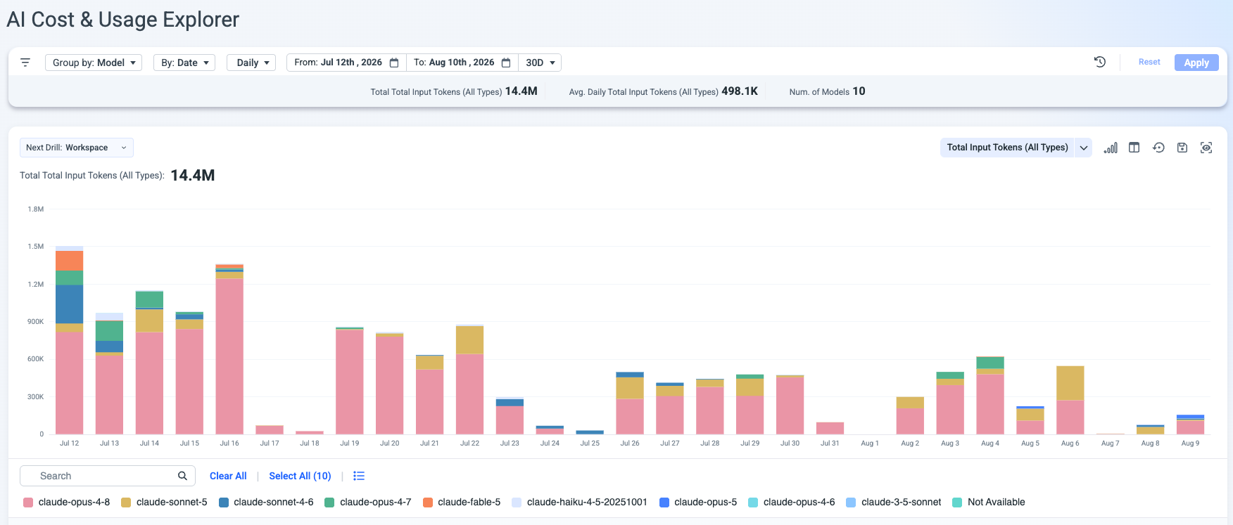
Chart and drill-down
The chart displays a stacked bar view grouped by the selected dimension. Each color in the legend represents a distinct value (e.g. a specific model when grouped by Model).
Next Drill - a pill above the chart (e.g. "Next Drill: Workspace") indicates the dimension you will drill into when you click a chart segment.
Details table
Below the chart, the Details table shows the underlying data in tabular form. Table controls include:
| Control | What it does |
|---|---|
| Trend | Overlay a trend indicator on each row. |
| Show % from total | Display each row's share of total cost. |
| Pivot | Pivot the table dimensions. |
| Filter Results | Apply additional filters to the table independently. |
| Export (⬇) | Download the table data. |
Investigate a cost spike
- Open the AI Cost & Usage Explorer.
- Set the date range to cover the spike period and a few days before it.
- Group by Model to see which model's cost increased.
- Click the spike bar to drill down by the Next Drill dimension (e.g. Workspace) and identify which team or environment drove the increase.
- Optionally, filter by User or API Key to narrow to the specific caller.
Run a chargeback report
- Set Group by to Workspace (or the dimension that maps to your cost center structure).
- Set the date range to the billing period (e.g. the previous calendar month).
- Review the Details table - each row shows one workspace's total cost.
- Export the table for your chargeback workflow.
Evaluate caching ROI
- Filter by Token Type to isolate cache-related token categories.
- Compare the cost share of cache reads vs. uncached input tokens.
- If cache reads represent a meaningful share of total input tokens, your caching strategy is reducing effective input cost. If uncached input still dominates, review your caching configuration.
Updated 1 minute ago