
AI Cost & Usage Explorer
Overview
The AI Cost & Usage Explorer gives you one page to investigate what your AI usage is costing you and where it's coming from. It pairs a chart with a matching details table, so you can spot a spend or usage spike visually and immediately see the exact numbers behind it - by model, by day, by workspace, or by any other field you group or filter on.
Data freshness: The page header shows a "Latest invoice date" badge (for example, "Latest invoice date: Sep 7, 2026") so you always know how current the underlying billing data is.
How the page is built
The Explorer has two linked views of the same data:
- The chart - a chart plotting your selected measurement (for example, Tokens) over time.
- The Details table - underneath the chart, a row-per-value breakdown (for example, one row per model) with one column per day in the selected date range.
Because both views share the same grouping, filters, date range, and measurement, changing any of those controls updates the chart and the table together.
Above both views, a summary strip shows top-line totals for the current selection: Total Unblended, Total Amortized, Total Tokens, Total Requests, Active Users, and Num. of Models. Click the collapse arrow above this strip to hide or show it.
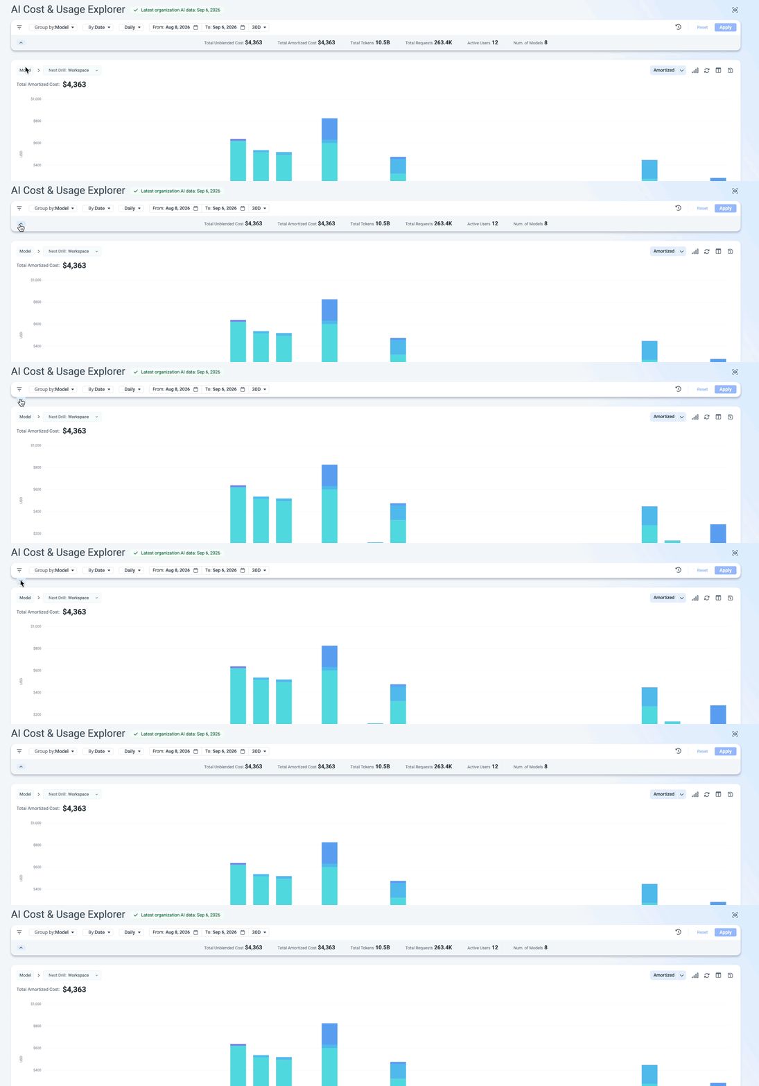
Grouping and time range
The toolbar above the chart controls what the chart and table are built from:
| Control | What it does |
|---|---|
| Group by | Sets the field the chart and table break down by. For example, grouping by model gives you a breakdown by model |
| Secondary Group by | Sets the secondary grouping. For example, grouping by users, and then you can see for each user which models they used. |
| Granularity | Sets how the time range is bucketed: Hourly, Daily, Weekly, Monthly, Quarterly, Yearly |
| From / To | Pick the exact start and end dates of the range you want to explore. |
| Range preset | A shortcut for common date ranges instead of setting From/To manually. |
Remember to apply: Changes to grouping, date range, or filters don't take effect until you click Apply.
Filters
Click the filter icon to open the Filters panel on the left. It has three parts:
-
Providers - affects the dimensions displayed in the filter. For example, if only Anthropic is selected, it will show only Anthropic-related fields.
-
Match between fields - Sets how the filter fields combine. AND = a record must match every field you filtered on. OR = it only has to match one of them.
-
Field filters - a scrollable list of filterable fields, each with an Include dropdown:
Field Availability Notes Model All The specific AI model used -
AWS Models are derived from the Services and from the resource name.
For example : arn:aws:bedrock:eu-west-1:714679113894:inference-profile/eu.anthropic.claude-opus-5
User All The individual user who generated the usage Team All The team the usage is attributed to Product Anthropic Products of the AI Provider Token Type All The type of token consumed (input/output/etc) Linked Account All The linked billing account Account All The account the usage rolls up to Workspace Anthropic Workspace API Key Anthropic The API key used to make the request Service Tier All The service tier of the request Region AWS The region the usage came from Invocation Type AWS How the request was invoked Context Window Anthropic The context window size used -
Choosing what you're measuring
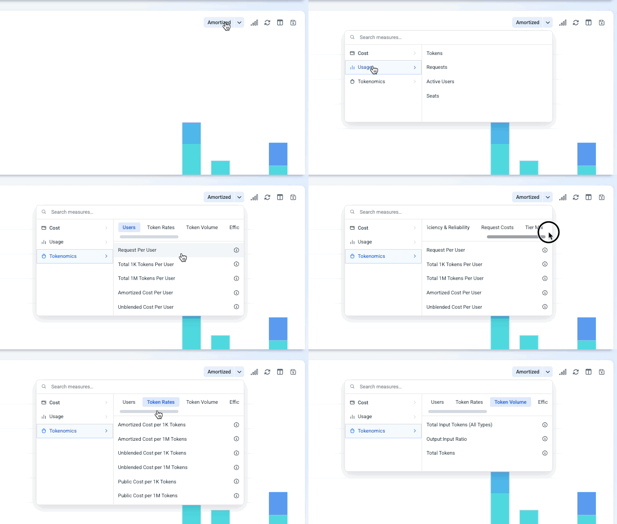
The dropdown above the chart (for example, "Tokens (1M)") sets which measurement the chart and table display. The measurements are:
- Cost - Amortized, Unblended, Public Cost.
- Usage - Tokens, Requests, Active Users, Seats.
- Tokenomics - Multiple tokenomics KPIs
Drilling into your data
There are two ways to move from a high-level view into more detail:
- Click to drill - click a value in the chart, or a row in the Details table, to drill into that value. The breadcrumb above the chart (for example, "Model >") tracks where you are in the drill path.
- Custom drilling - use the Next Drill dropdown (for example, "Next Drill: Workspace") to choose which field you drill into next for your custom analysis instead of the default path.
The chart menu
To the right of the measurement dropdown, the chart has its own row of controls:
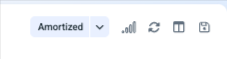
| Icon | Function |
|---|---|
| Chart type |
|
| Reset | Reset view |
| Custom views | Options for multiple custom views - see breakdown below |
| Save |
|
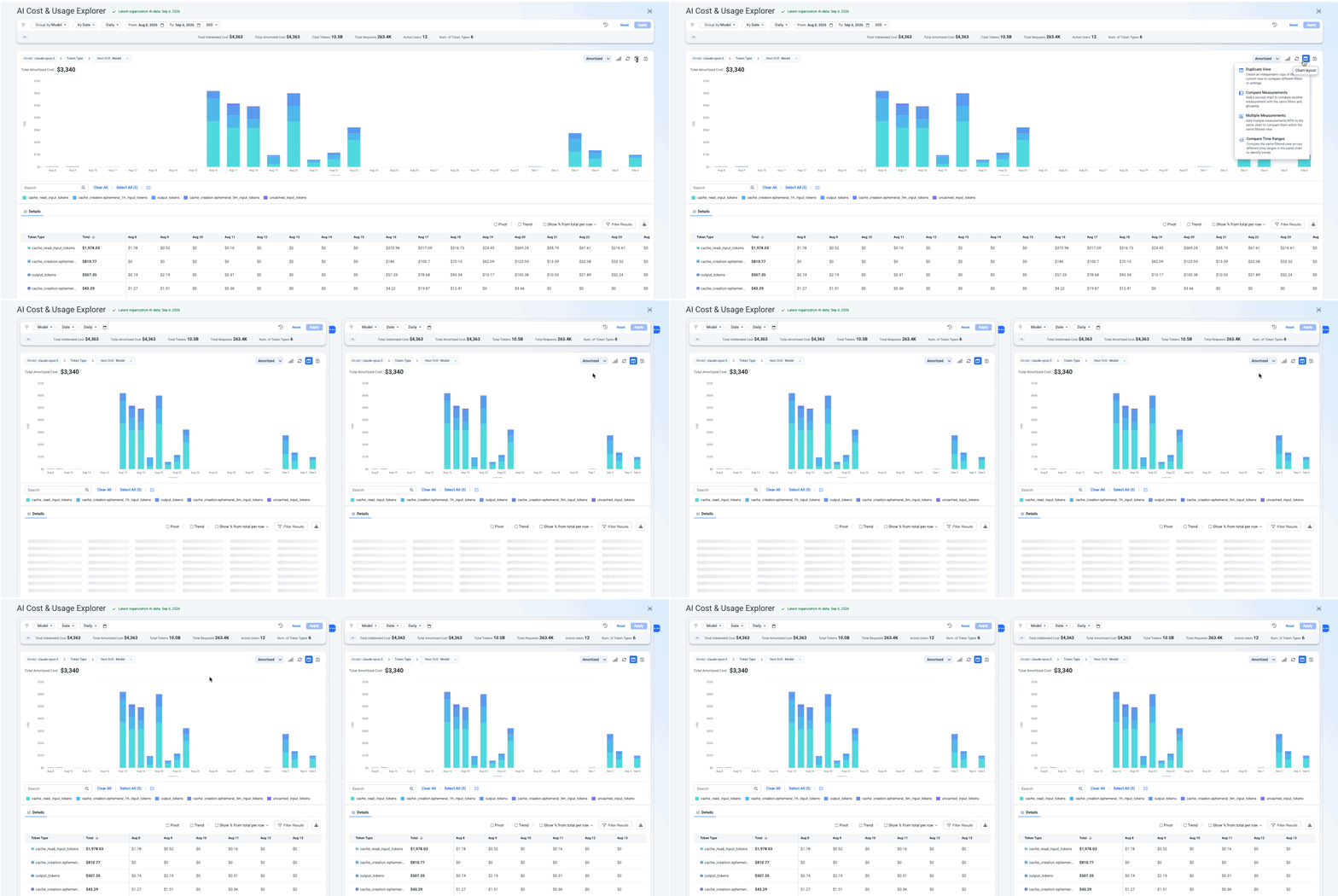
Custom views
-
Duplicate View: Create an independent copy of the current view and analyze two different views side by side
-
Compare Measurements: Add more charts (more or more) to compare other measurements with the same filters and grouping. For example, see the total tokens and the cost per 1M tokens.
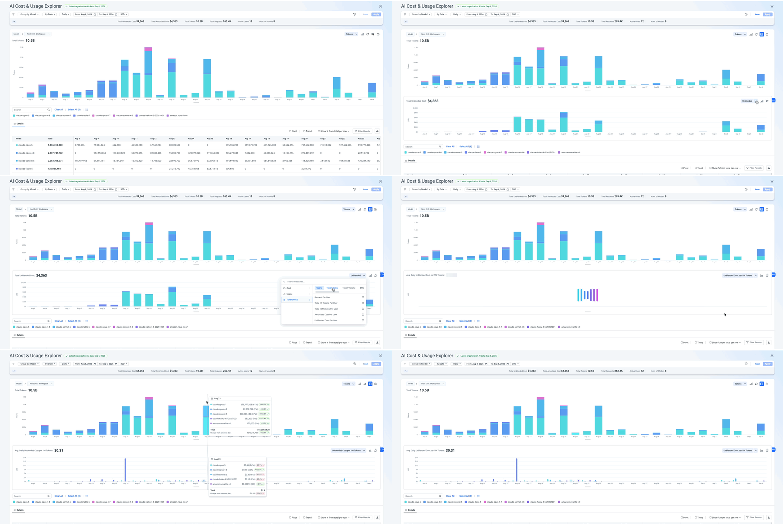
-
Multiple Measurements: Add multiple measurements to the same chart to compare them in the same view.
Note that you can control the chart for each measurement on the chart.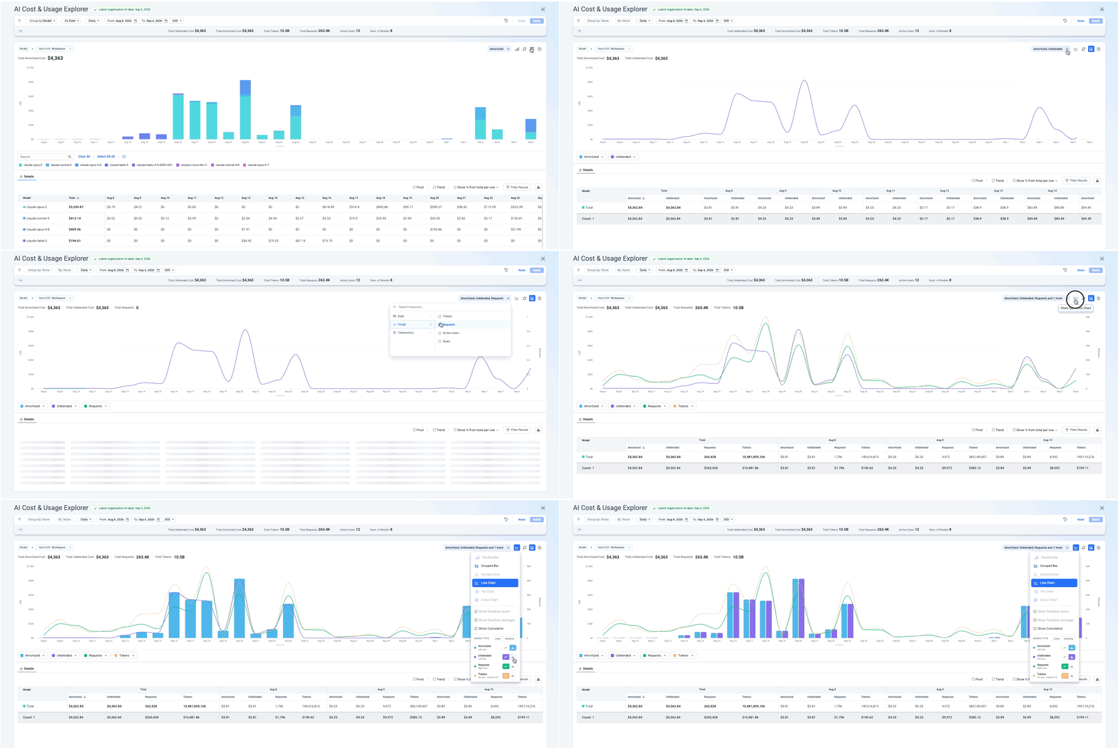
-
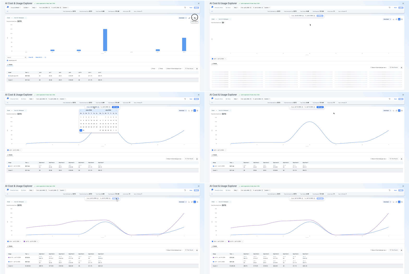
Compare Time Ranges: Compare the same filtered view across different time ranges in the same chart to identify trends. For example, compare the model claude-opus-4-8 from the current week with the previous week.
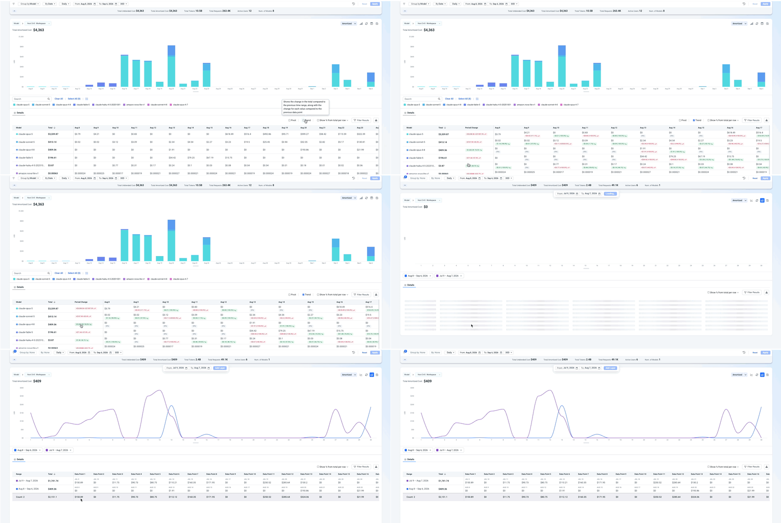
Note: In the table view, if you notice a large change in cost or usage compared to the previous time range, look for the chip flagging that change. Click it, and it will open the compare time ranges option on the chart, filtered for those two time ranges.
Search History
Next to Reset and Apply, the circular arrow icon opens your search history. Each user gets their own history of previous searches on the Explorer, so instead of rebuilding a grouping, date range, and filter combination from scratch, you can open the history and jump straight back to a view you already built.
This is personal to each user - it's not a shared or team-wide list of views.
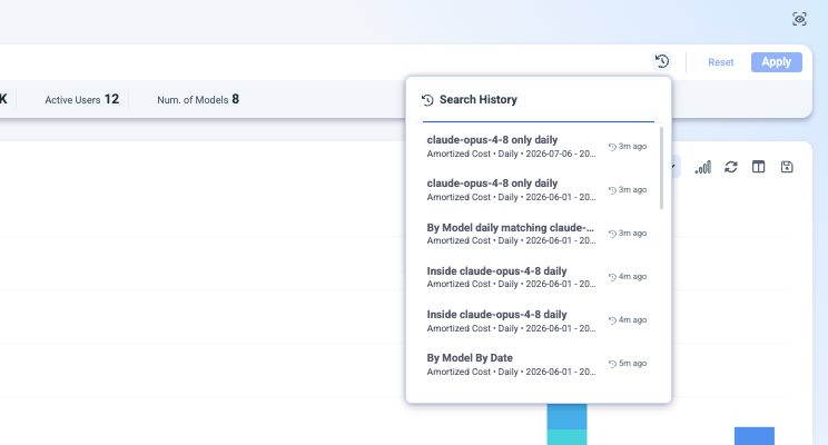
Table View
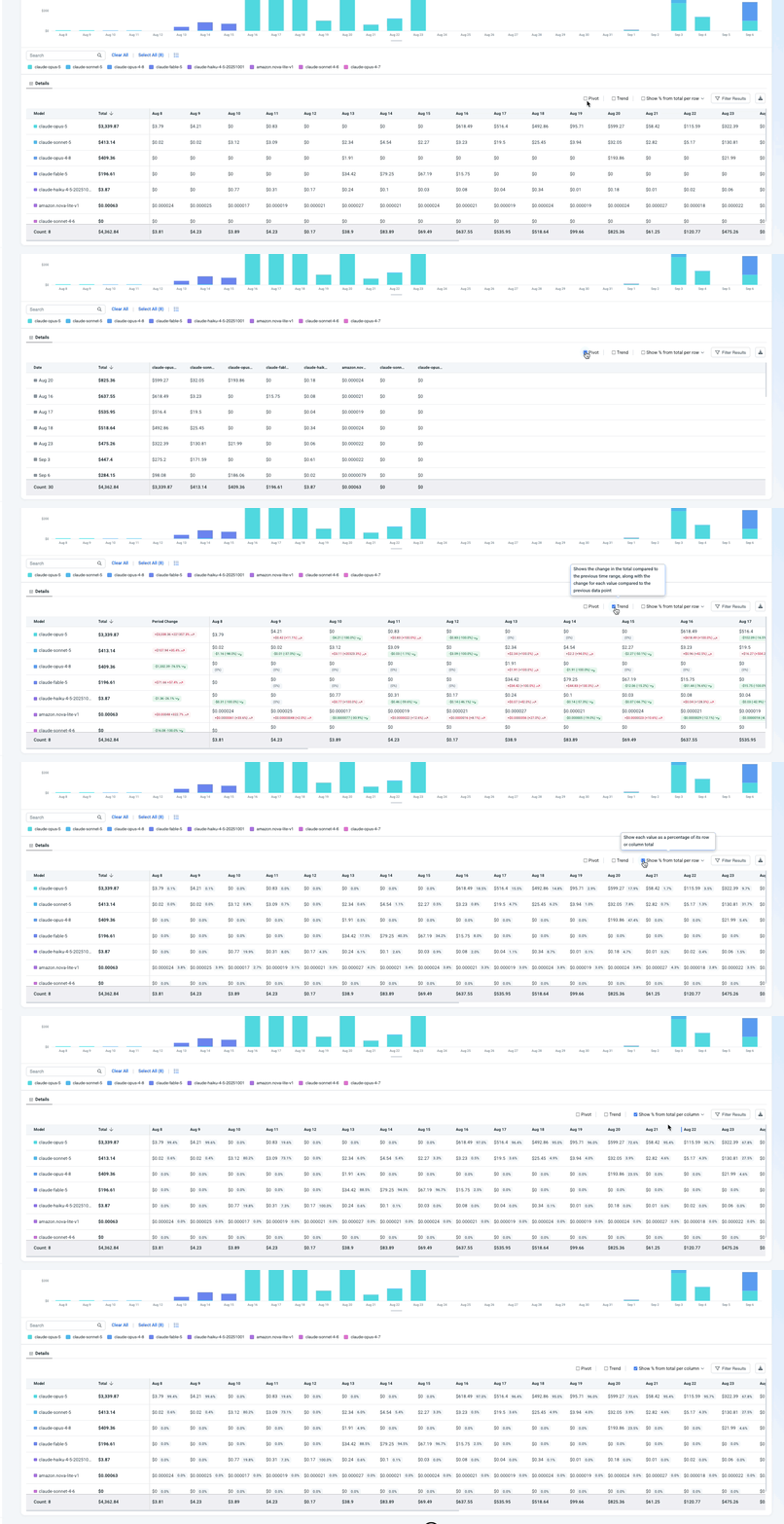
Below the chart, the Details table lists one row per grouped value (for example, one row per model). The table always reflects the same chart selection - filters, time range, views, and more - so the two stay in sync as you adjust either one. Main capabilities:
- Hover to highlight - hovering over a value in the table highlights the matching series in the chart.
- Filter results - filter the table down to specific rows or values.
- Download as CSV - export the table data.
- Pivot - reflow the table, swapping rows and columns.
- Trend - see the change compared to the previous time range.
- Show % from total - display each cell as a percentage of its row or column total.
Updated 24 days ago